
Walking into Interrestrial, you could be forgiven for any initial confusion. An exhibition built on getting interactive with the artworks – and delicate ceramics at that – confronts all our expectations about how to experience art. Interrestrial asks the visitor to make, to identify, to re-arrange, discover, scratch at, walk among and consume its works.
The foyer of Nishi Gallery, New Acton, is dedicated to Community Vessels, 2015, by Richilde Flavell. In the piece, Flavell asks visitors to select raw clay pieces and shape them into miniature sculptures, which are then placed at a location of choice on the floor, where a large sketched outline of Canberra waits. Walking through this as giants, visitors move towards Verney Burness’ Moving Mountains, 2015, where we are immersed in the shattered remnants of mountain-scapes and fractured icebergs in miniature. These tactile delights are able to be glided and scratched across their plexiglass foundations, becoming new arrangements at the imagination of the visitor. In her practice, Burness photographs her arrangements, creating surreal worlds that reflect from glass and mirror surfaces.
Michelle Lim’s Memories in Motion, 2015, recall memories and sayings, as she invites the visitors to drink from her porcelain tumbler sets to reveal the hidden messages beneath, while Zoë Slee’s Embowered in Porcelain, 2015, arranges delicate bones of porcelain with wool and plum wood into arched, glorious bowers that draw the visitor into their natural pathways.
Isabelle Mackay-Sim completes the artists on display, with her Constructed Entities, 2015, showcasing a series of glazed sculptures that recall floral and organic artefacts. The textured parts are able to be layered and assembled into new combinations, creating alien plant life with excitingly rich surprises.
As recent graduates from the ANU School of Art, the artists shown in Interrestrial have a refreshing vitality and willingness to challenge the professional art world. Not without the occasional unfortunate casualty, Interrestrial is an experimental exhibition experience that will draw in and challenge you to create alongside the artists. The muted colour palette and themes of memory, imagination, and natural beauty create a cohesive group of works within the striking, concrete mass of the Nishi Gallery. Interrestrial is an exhibition not to miss as we welcome in spring and the start of an exciting exhibition season in the nation’s capital.
Interrestrial is on at Nishi Gallery, 15 Edinburgh Avenue, Canberra, from 28 August – 13 September, 2015. Join the event on Facebook at: www.facebook.com/events/389266924604554/
-

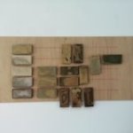
- Richilde Flavell, Community Vessels, 2015. Unfired clay, stoneware vessels, slips various, tape.
-

- Richilde Flavell, Community Vessels, 2015. Unfired clay, stoneware vessels, slips various, tape.
-
- Richilde Flavell, Stacks and Lines, 2015. Red stoneware, BRT, white rake, recycled clay, stoneware slip, fourteen glazes, nails, spray paint.
-

- Richilde Flavell, Stacks and Lines, 2015. Red stoneware, BRT, white rake, recycled clay, stoneware slip, fourteen glazes, nails, spray paint.
-
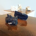
- Verney Burness, Moving mountains, 2015. Ceramics, plexiglass, spray paint, photography.
-

- Verney Burness, Moving mountains, 2015. Ceramics, plexiglass, spray paint, photography.
-
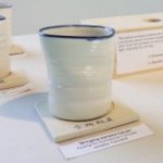
- Michelle Lim, Memories in motion, 2015. Porcelain tumblers, stoneware coasters, light box.
-

- Michelle Lim, Memories in motion, 2015. Porcelain tumblers, stoneware coasters, light box.

-

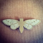
- Isabelle Mackay-Sim, Constructed entities, 2015. Glazed stoneware, nylon flocking, nail polish, rubber coating, acrylic paint, plaster, beeswax.
-

- Isabelle Mackay-Sim, Constructed entities, 2015. Glazed stoneware, nylon flocking, nail polish, rubber coating, acrylic paint, plaster, beeswax.
-

- Isabelle Mackay-Sim, Constructed entities, 2015. Glazed stoneware, nylon flocking, nail polish, rubber coating, acrylic paint, plaster, beeswax.